Pantone To Designers: Go Bold With Greenery


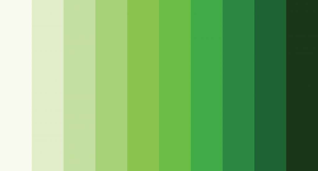
Summary: Greenery, as the Pantone color of the year 2017, was selected from over 1,000 submissions from designers, artists, and other design community members. Dive in to understand why this color and what the selection means for your brand.
The Powerful Hue
Pantone announced the "bright and powerful" green as its Color of the Year for 2017!
Pantone has used the green shade since 1993 to communicate with consumers about what's cool and trendy in fashion. However, the 2017 Pantone green color of choice has a unique meaning—it represents sustainability and environmental awareness.
Signification of Pantone Green
Pantone's 2017 Color of the Year signals a fresh start.
According to the company, the color is intended to help people feel optimistic, energized, and motivated. It's also meant to make people feel more connected with nature.
"Green is universally loved as well as universally recognizable," said Leatrice Eiseman, executive director of the Pantone Color Institute. "It has been used in everything from fashion and food to decorating and gardening."
Pantone's latest color of the year is a little bit of a departure in a world full of bold colors and vibrant shades.
Pantone has selected the hue as a "fresh new workhorse color" with an "energetic vibe."
What Does the 2017 Pantone Color Convey?
Pantone Green is the hue of rebirth and renewal. The color can be used to convey a message of growth, prosperity, and stability.
In a world where people have become increasingly aware of their actions' impact on the environment, the color green has become one of the most popular and powerful symbols of sustainability.
The Pantone color 2017 is can be used to express hope, optimism, success, and abundance.
Healthy Greens!

Green could be the new black! Greenery is great for any project where you want to communicate a fresh start or a new beginning, from your collections and packaging to branding and advertising campaigns.
Pantone, the world's leading colour authority, sends that message with its 2017 Color of the Year: Greenery. It's a nod to nature and has something for every fashion brand — from high-end to low-key.
The award-winning color, which Pantone describes as "a bright and powerful green," is perfect for spring-summer and autumn-winter because it can be used in print and digital media. Moreover, it can be paired with trending pastels like pale blue or mint green.
Pantone green is also ideal for brands that want their clothing to be on trend without being too trendy. It's not so bold that it will be off-putting, but it's not so subtle that you forget about it within seconds of putting it on.
So whether you're looking for something modern and fresh or classic yet edgy, there are ways to incorporate this hue into your wardrobe this year.
Using Greenery in your brand will indeed help your brand make an impact!
Brands That Have Embraced Pantone Green
Here are some of the brands that have incorporated color into their collections:
Urban Outfitters: The retailer uses green tones in its fall collection with moss-green suede boots and leaf-shaped earrings.
Nordstrom: The retailer has already announced three new collaborations with fashion designers, including one featuring a collaborative effort between fashion designer Zac Posen and Panton.
Influence of Greenery
The influence of greenery is on the rise in fashion, beauty, industrial design, architecture, and consumer packaging.
The color has become so popular that it's already been adopted by top designers. Brands are already incorporating Green into their products and brand identity, from clothing to makeup to accessories. From Pantone's original description: "The green hue reflects nature and nature's cycles as well as growth and renewal."
The Pantone Color Institute chose Greenery as the most powerful hue after studying more than 100,000 Pantone swatches of products across industries.
The color trend is taking off in fashion thanks to its versatility and ability to add life to almost everything.
Pantone green has become more than a trend; it's now a way of life.
Way Forward
In a highly saturated industry like fashion, it can be hard to stand out. However, there's one thing that's always guaranteed to get people talking: Green, a color that shouts nature. This is why Pantone's 2017 Color of the Year is a "bright and powerful" green, which will influence design and fashion for the next 12 months.
Key Takeaways:
- It makes sense that Green is so popular right now because it's one of those colors that can be used in various ways — from using it as an accent color on a garment or accessory to using it as an all-over accent on an entire look.
- If you want your brand to stand out, incorporating some color variation into your designs is a great way to do so!

If your brand needs help cashing in on this trend, Fashinza is here. Fashinza is an AI-powered platform that provides hassle-free solutions to expedite your processes, from design to production. Get in touch with us today!
To learn more about the colors and trends, hop onto read our blog here.


